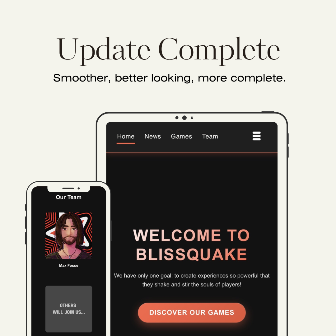
The studio’s website gets a fresh new look! After several weeks of work, we’re excited to present a major update that improves both the style and the overall browsing experience.
First highlight: a brand-new "Team" page. Even though the studio is still carried by a single person for now, this page will help track its evolution and highlight future members who will join the adventure.
The site also gets a new visual identity: the old look is gone, everything has been redesigned around orange and black, the studio’s signature colors. This redesign is especially noticeable on the homepage, which has been completely reimagined to feel warmer, more dynamic, and to spark curiosity about the project.
On the content side, several key adjustments: pages for already released games have been simplified with the removal of the Trello (links remain available on Discord), while the game pages themselves are now smoother thanks to new animations for covers and navigation arrows.
The News page has also been thoroughly revamped: articles now use a true card layout, with more spacing between them, new animations and transitions, and the addition of visual badges to better identify each topic. The result: a more modern, cleaner look that really makes you want to click on the article that catches your eye.
Among the notable additions, you’ll also find a link to the Steam group at the bottom of the page (which will evolve into a full Steam studio page once the first game is released), as well as several technical improvements like fixing the bug that slowed down the social menu on the first click, or a visual overhaul of the sorting boxes for a more modern look
Finally, a small note: links to X have been removed following the closure of the account. The studio will now focus on communicating through Discord, Instagram, YouTube, and the website.
And that’s not all: many small tweaks and optimizations round out this update, making navigation smoother than ever. Feel free to take a look and explore all the new features!


Discord
Instagram
YouTube